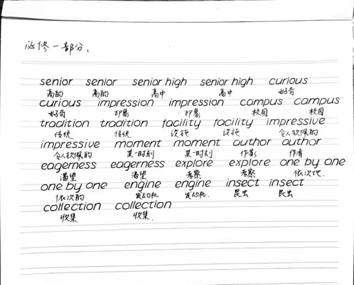
you have very legible and clean handwriting, but your proportions reduce legibility. all the letters do not have to be uniformly the same height, many need to be taller or shorter than others. if you look at the early writing books for children learning english you’ll see that instead of there beibg one “tier” for the letters to sit on, there are actually two. Capital letters are twice as tall as most lowercase letters and the majority of a lowercase letter is still in the lower tier, but ascenders and descenders should be full height which helps make it a lot more distinct.

d, h, l, f and t could all be a bit taller. Same for the line downwards from p.


box for f is wrong in second image. f always has an ascender and sometimes has a descender but is drawn with just a descender box
Good spot. And I love lowercase 𝑓 with ascender and descender.
𝑓𝑎𝑟𝑡𝑠
They wanted praise and oohs and aahs, not actual critique, though.
How do you know that? If we’re talking about assumptions, I assumed they wanted to know how to improve.
How do you know that? Since we’re both making assumptions. It’s extremely well done writing, it’s almost 100% perfect. When students come and show stuff like that and ask if they’re good enough, they’re fishing for compliments. It’s playing coy. Just say, hey, look at my pretty handwriting, instead of pretending to be oblivious.
How do you know? You interact with human beings over a lifetime. How do you know when someone is being sarcastic, or giving an underhanded compliment, or being suspicious, or flirting? You just do, because you’re human, and you are among humans. If you don’t, you’re just inexperienced, young, or oblivious. You can’t just take everything people tell you at face value and run with it, that’s how you get duped and fucked in the ass.
It’s pretty good, easier to read than most native speakers I’d say.
If I had to give a critique, I’d say the letters are rather round, so it can be hard to tell an ‘a’ from an ‘o’, but most people develop quirks like that in English so it’s perfectly fine.
It’s so neat. It’s obvious it’s not your first language. Beautiful
In my country English alphabets are practiced in four lines rather that two lines. This helps you to get the highs and lows of certain letters like h, p, t, g, y. You definitely don’t want the reader to confuse your n and h. It’s still a neat looking handwriting tho.
Very neat, though it looks like you’re afraid of ascenders and decenders. your f’s look cut off at the top, your h’s looks a little like n’s, etc. Looks like you’re trying to stick to a rule from a different alphabet that everything is the same height; the Latin alphabet doesn’t work like that, or at least, it doesn’t in lowercase.
this handwriting is too good it’s going to piss someone off
I’m already triggered that mine isn’t that nice!
Yeah…I don’t believe you this being handwriting.
(Jk, looks amazing. Almost like a font.)
your handwriting is a font. That’s amazing.
Sexy… I wanna bang your hand.
Your handwriting is far better than mine.
Mine looks like a 4th grader mixed with a doctor.
Firstly, your penmanship is great, better than mine as a native tech worker.
For some actual feedback, your letter sizes for the same letters are a bit inconsistent. That just takes practice.
You are writing at a bit of a slant. That is not wrong but not that common, at least in the states.
You are trying to stay within the lines and that is causing you to change the shape of the letters if they are too large.
Your f’s could use a bit more curve. They look a little close to a t.
But seriously it looks great.
The slant in print writing I think stems from how curisve is (was?) taught in U.S elementary schools. I recall getting the very distinct advice to tilt my paper 45° for cursive writing and it ended up becoming a habit that carried over into my print writing.
Definitely I was taught to do it for cursive. My school system abandoned cursive after we learned it so I never got in that habit I guess
The tail of your ‘a’ could use a bit more definition
Yeah I thought “campus” said “compus”
I bought 1 computer, but my friend bought 2 compus.
Much better than my own handwriting. The only real feedback I have is to continue the curve on the top of the lowercase f a little longer
This is your actual handwriting? Far better than mine, and english is my native language, and I’m not from the USA so they taught us to read and write in school.
Hey, some of us went to school back in the day when they also taught us to read and write! 😜


